
Data Visualization
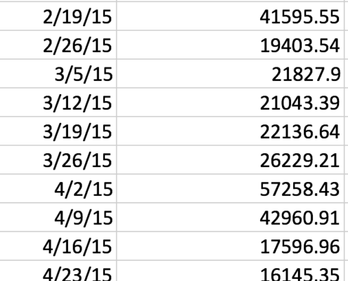
You’ve just received your sales numbers for the past month and you want to use them to help you understand the impact they are having on your revenue and inventories. What do you do? Do you print them out and start the laborious process of reviewing the numbers and comparing them to previous reports? Do you throw them in spreadsheet and use some formulas? While these methods could yield some results, the process can get laborious and you will only find what you’re looking for.
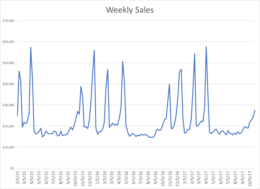
One method that can improve the speed and innovation of the decision-making process is data visualization. Data visualization is the presentation of data in a pictorial or graphical format. It enables decision makers to see analytics presented visually, so they can grasp difficult concepts or identify new patterns. (Taken from The SAS Institute) One strategy, then, when dealing with a large amount of data, is to experiment with several different visualizations to find new patterns and trends.
The data visualization shown above is a simple chart that can be created using Excel; more complex and interactive graphics can be created using more sophisticated analysis software such as Tableau or Microsoft PowerBI.

